Join us for a lecture and reception with Earle G. Shettleworth, Jr, Maine State Historian when he present an illustrated talk about Maine's mid-century modern domestic architecture at Holy Cross Church (1958). Afterwards, cross the street for a public reception to mark the 50th birthday of the South Portland Public Library (1967). The lecture is ticketed and the reception is free and open to the public.
by Chloe Martin
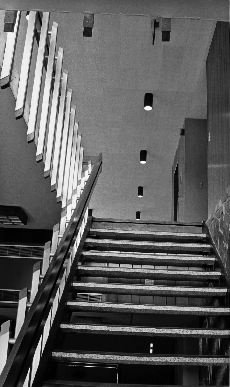
1960's Photos by Christopher Grasse Courtesy of the South Portland Public Library
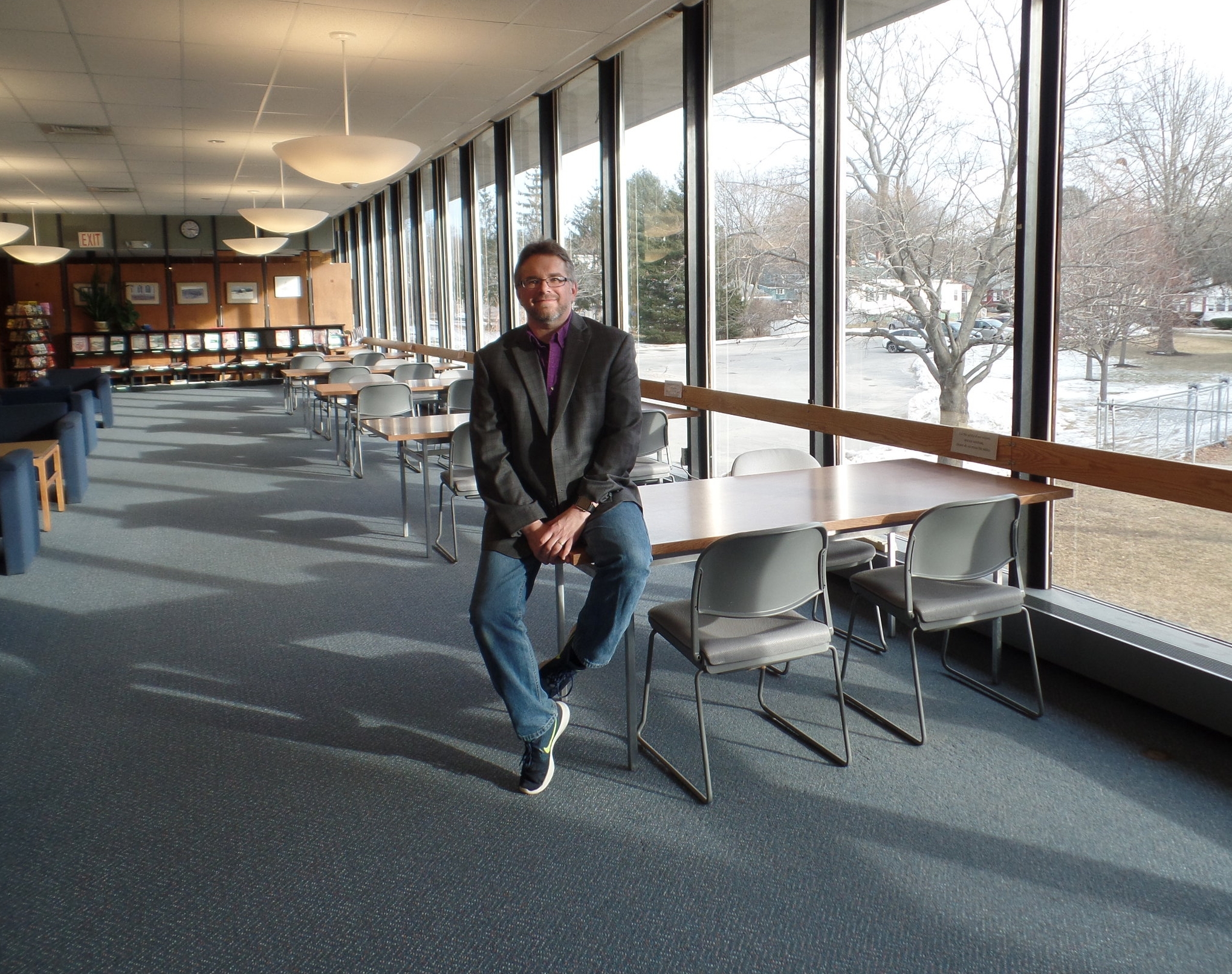
Photo By Kevin Davis
At night driving over the Casco Bay Bridge there is a beacon of South Portland city life: the Public Library. Over the past 10 years the Library’s executive director, Kevin Davis, has been peeling back the layers, ripping out the hedges, painting walls, and innovating library services to make the Library and its unique Mid-Century Modern architecture shine so bright. This summer the Library is celebrating the 50th Anniversary of its dedication. Let Greater Portland Landmarks be among the first to say, Happy Birthday!
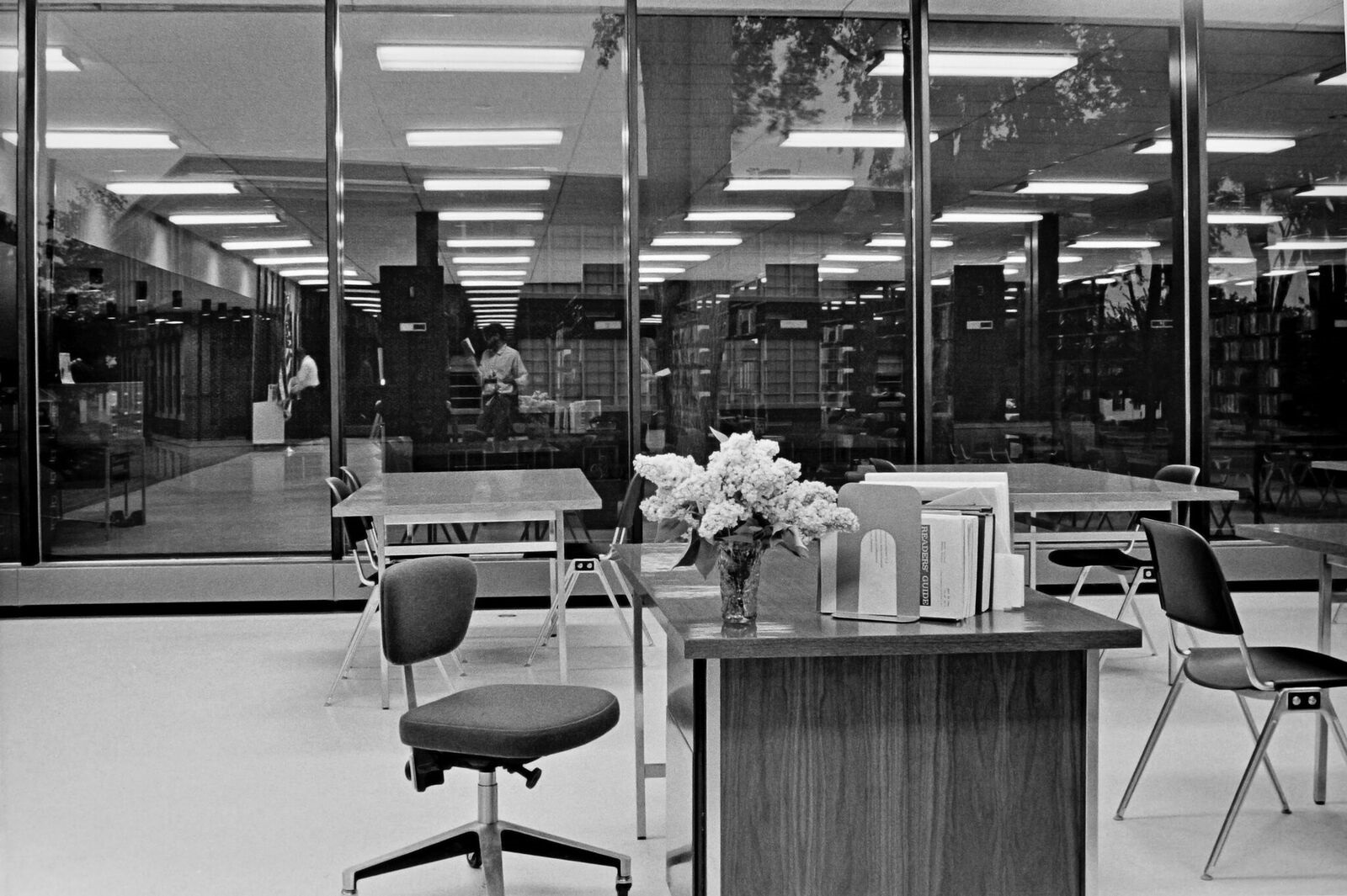
When Davis took over he immediately wanted to make the building more inviting and prominent to the community. With little money in the budget he did what he could. In 2007-8 he asked the DPW to rip out the giant over grown rhododendrons that blocked the sunlight from pouring in the front glass wall. This also let the light from the library pour out over the little hill that was built around it, making it so distinguishable from a distance. This simple collaboration of city resources highlighted the architecture of the building and made it easier to make the case for more restoration of the library. “Numbers increased drastically” Davis said, “the increased visibility of the building alone, brought more people into it. Period.” Soon after the city started chipping away at other projects. Next the building’s distinctive concrete was preserved.
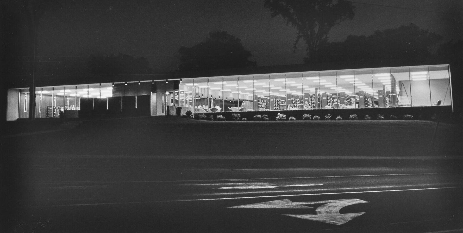
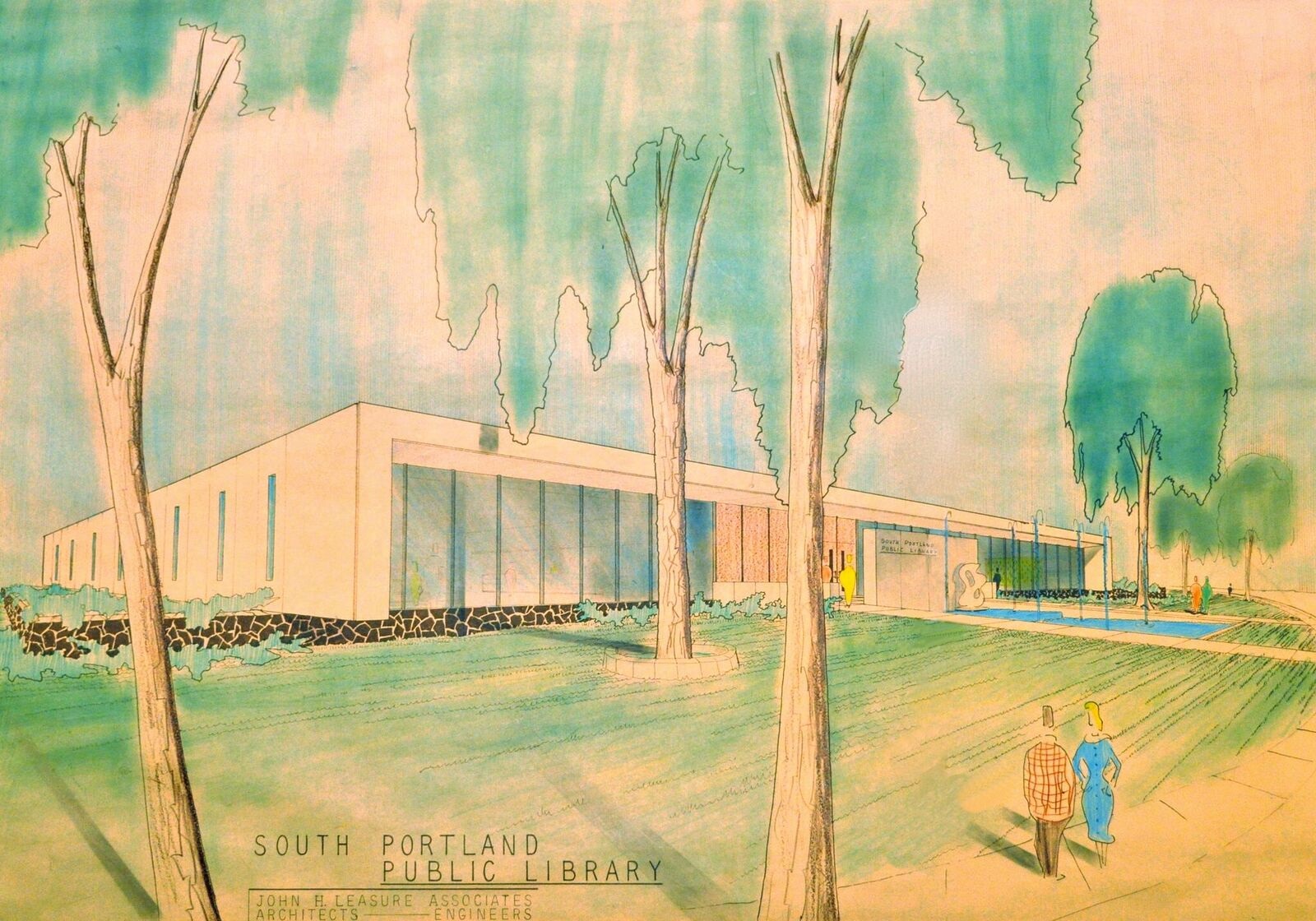
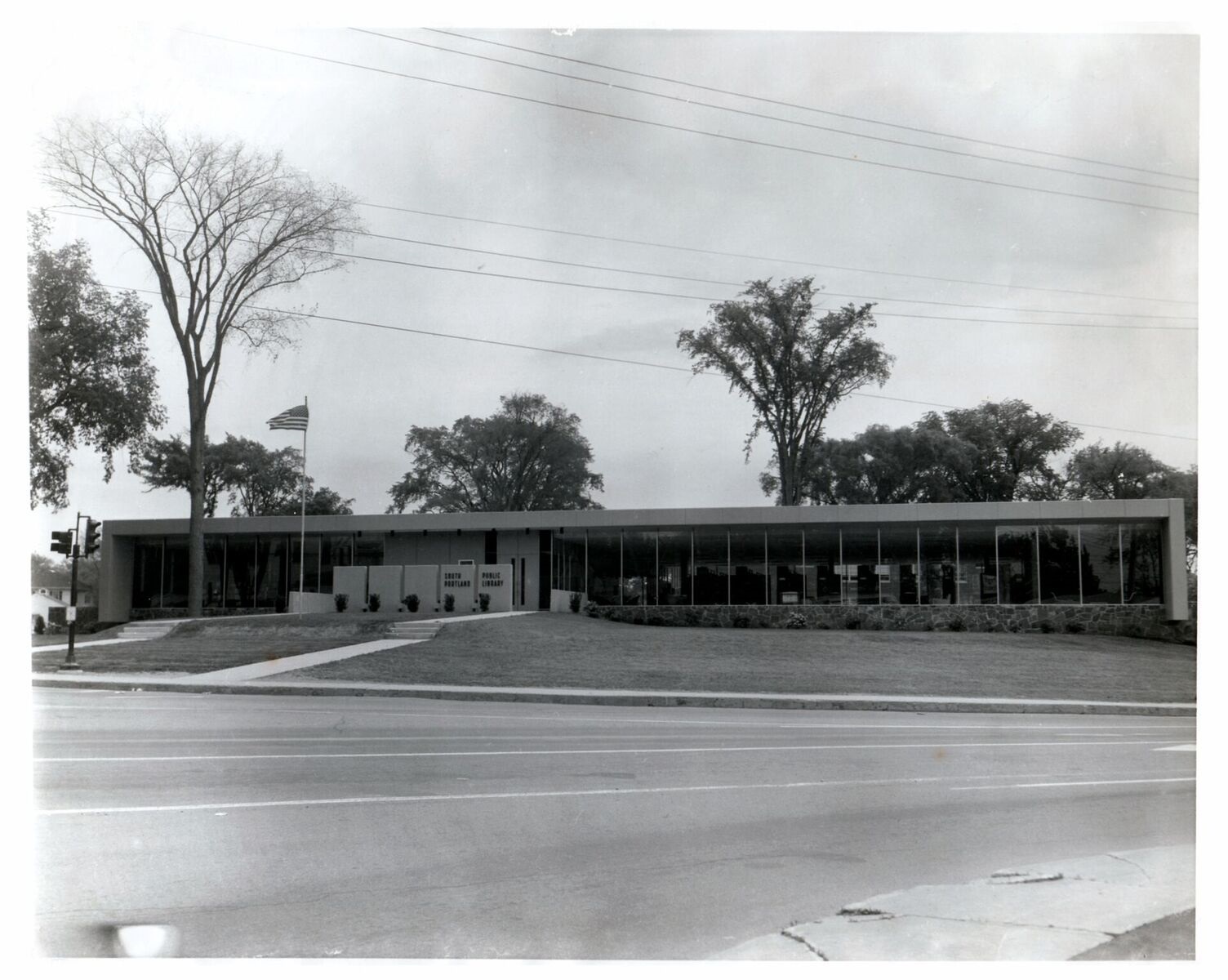
One characteristic of Mid-Century Modern architecture, free-flowing and open plans, has made the building adaptable as library services have changed dramatically in the last 5 decades. “As one use has gone away over the years we have moved another into it,” Davis said, “Not being hemmed in by walls and designated spaces is good!” Designed by local architect, John Leasure, the exterior design created a monolithic concrete shell around a glass building that rests on a native stone base. Leasure was a sought after architect taking on many well-known projects during urban renewal. While he designed the controversial Holiday Inn by the Bay and Franklin Towers along Portland’s new arterial streets, he also created the pool section of the South Portland Community Center and the Maine State Veterans Cemetery Chapel with its bold use of stained glass and innovative design to accommodate winter funerals.
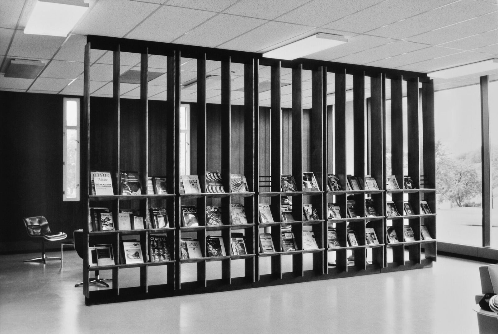
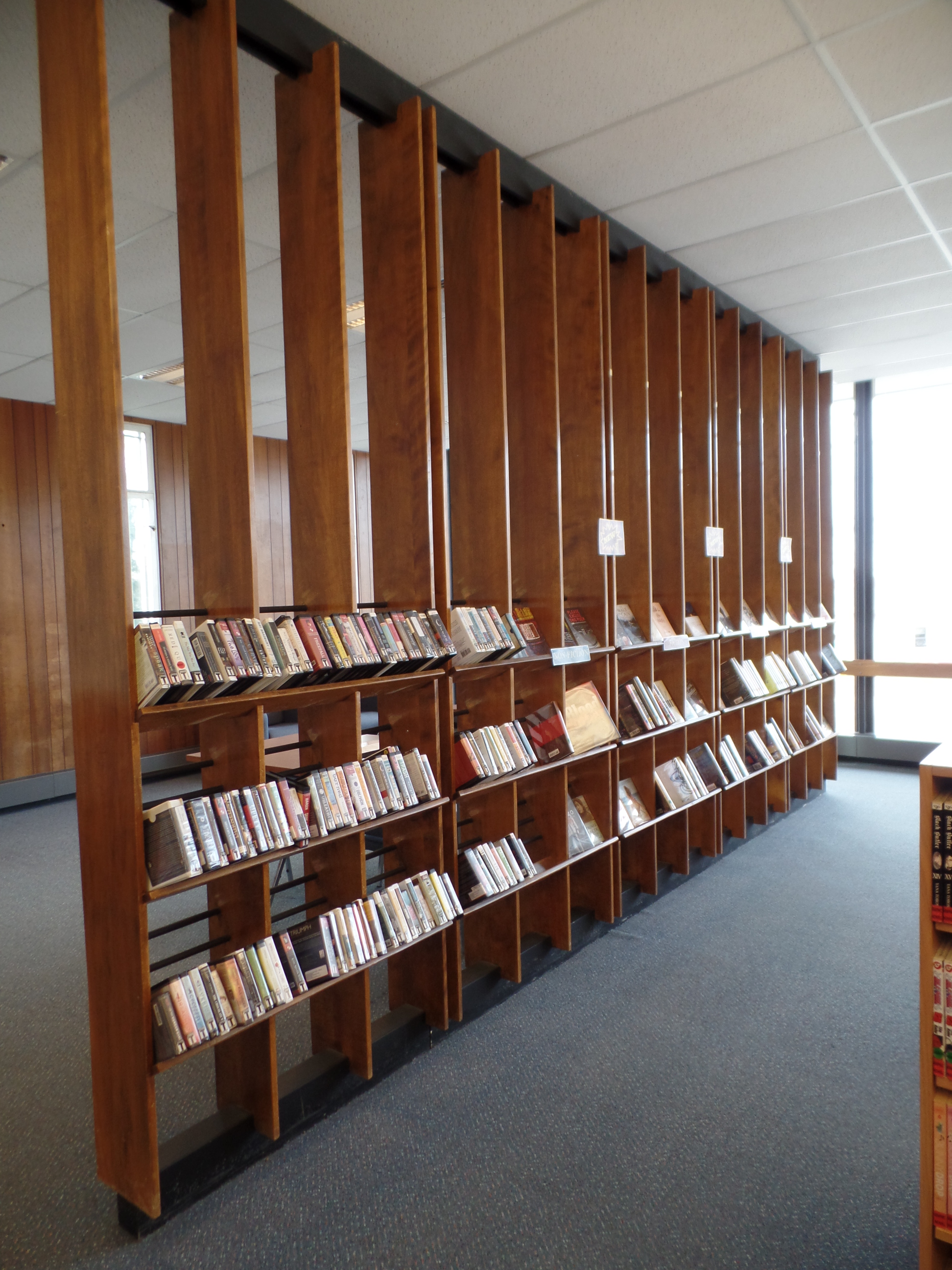
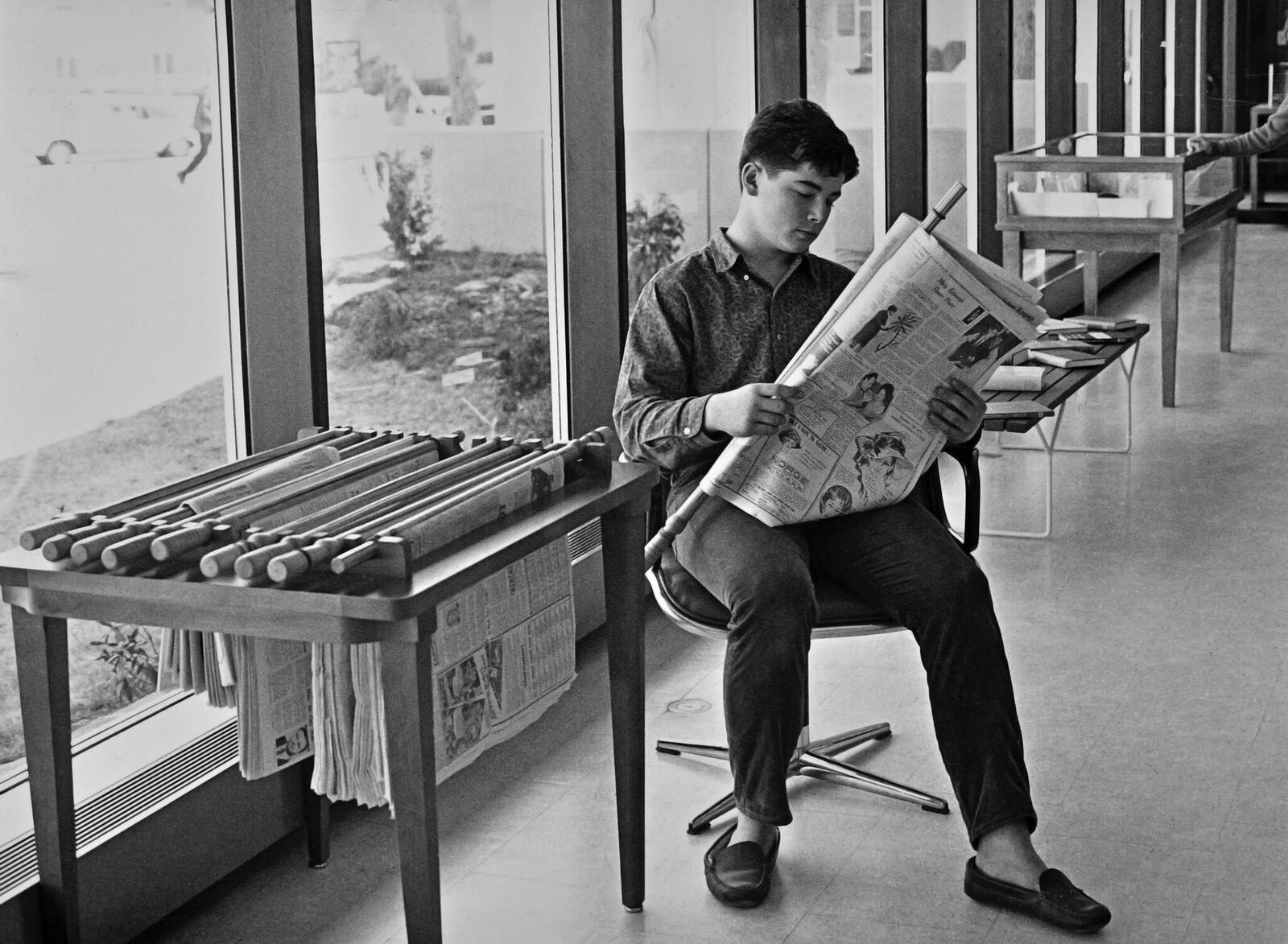
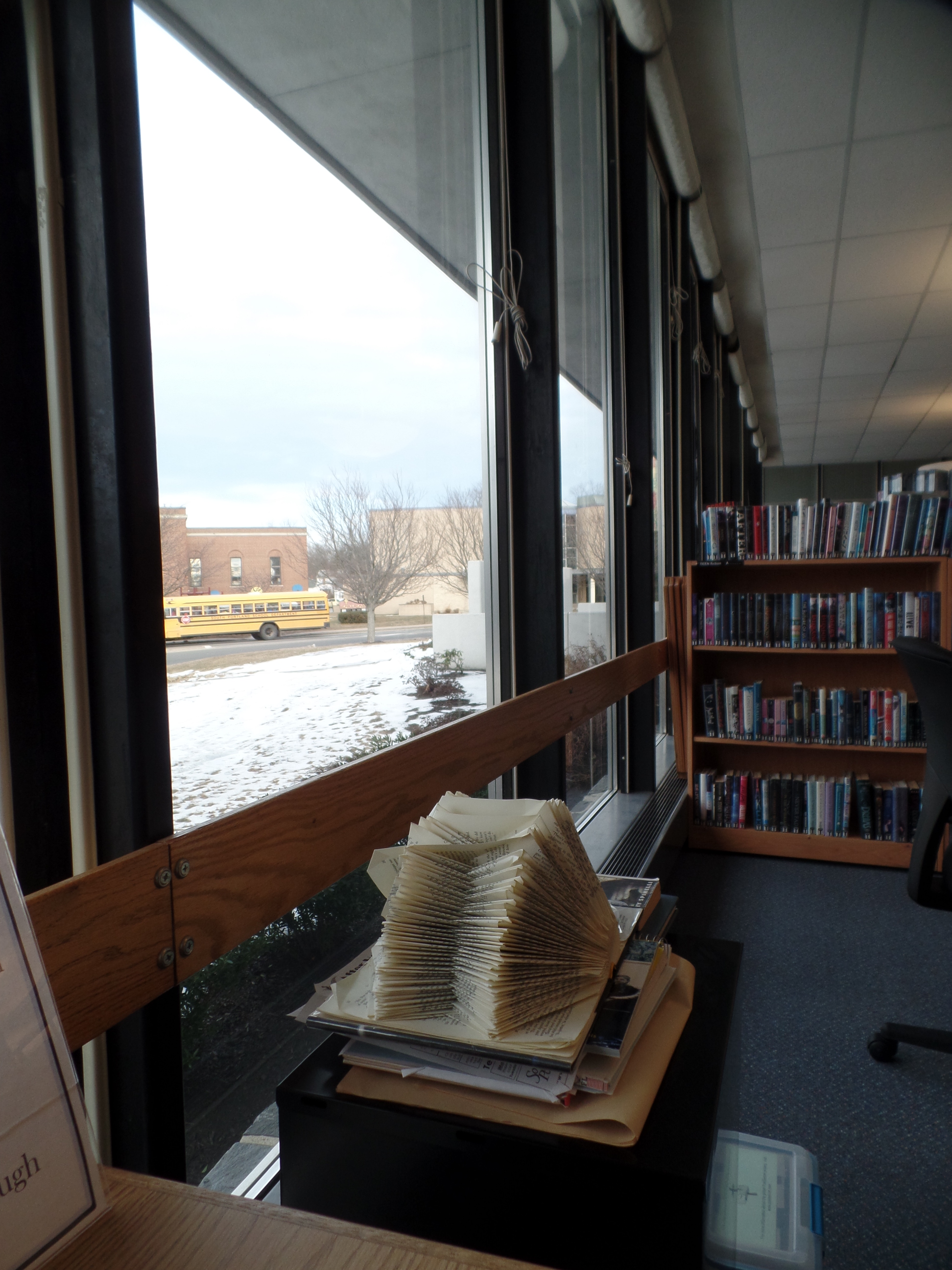

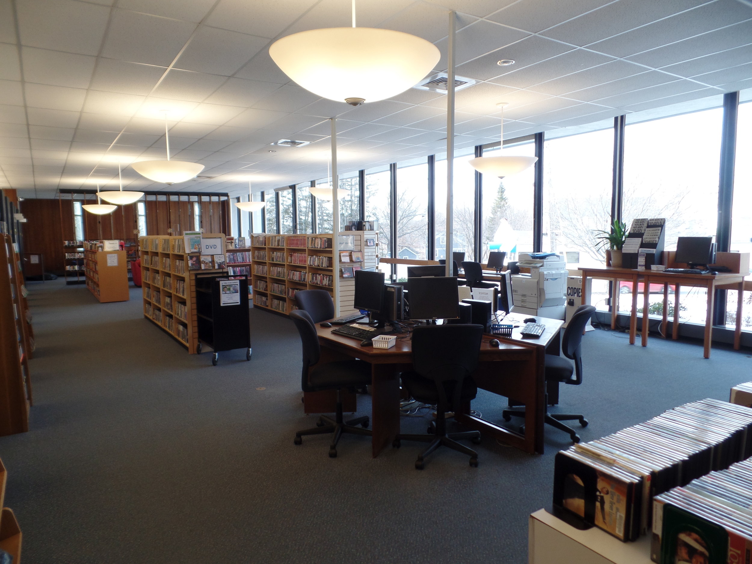
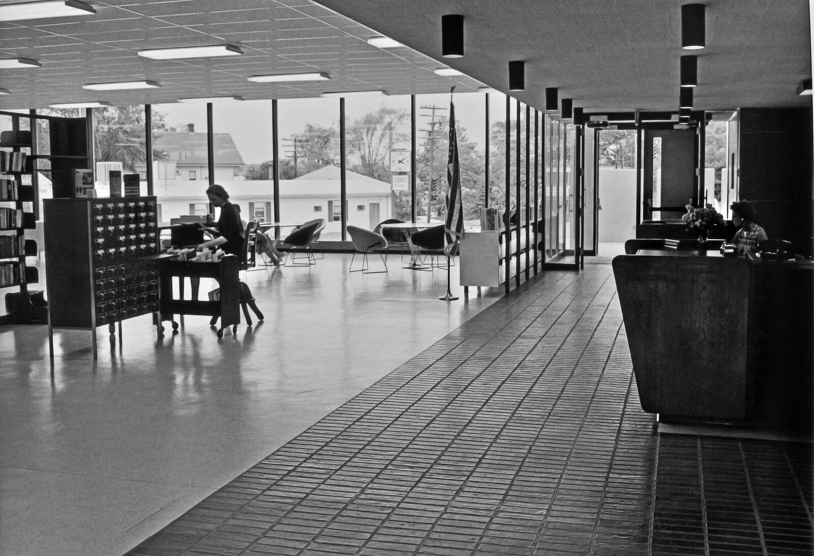
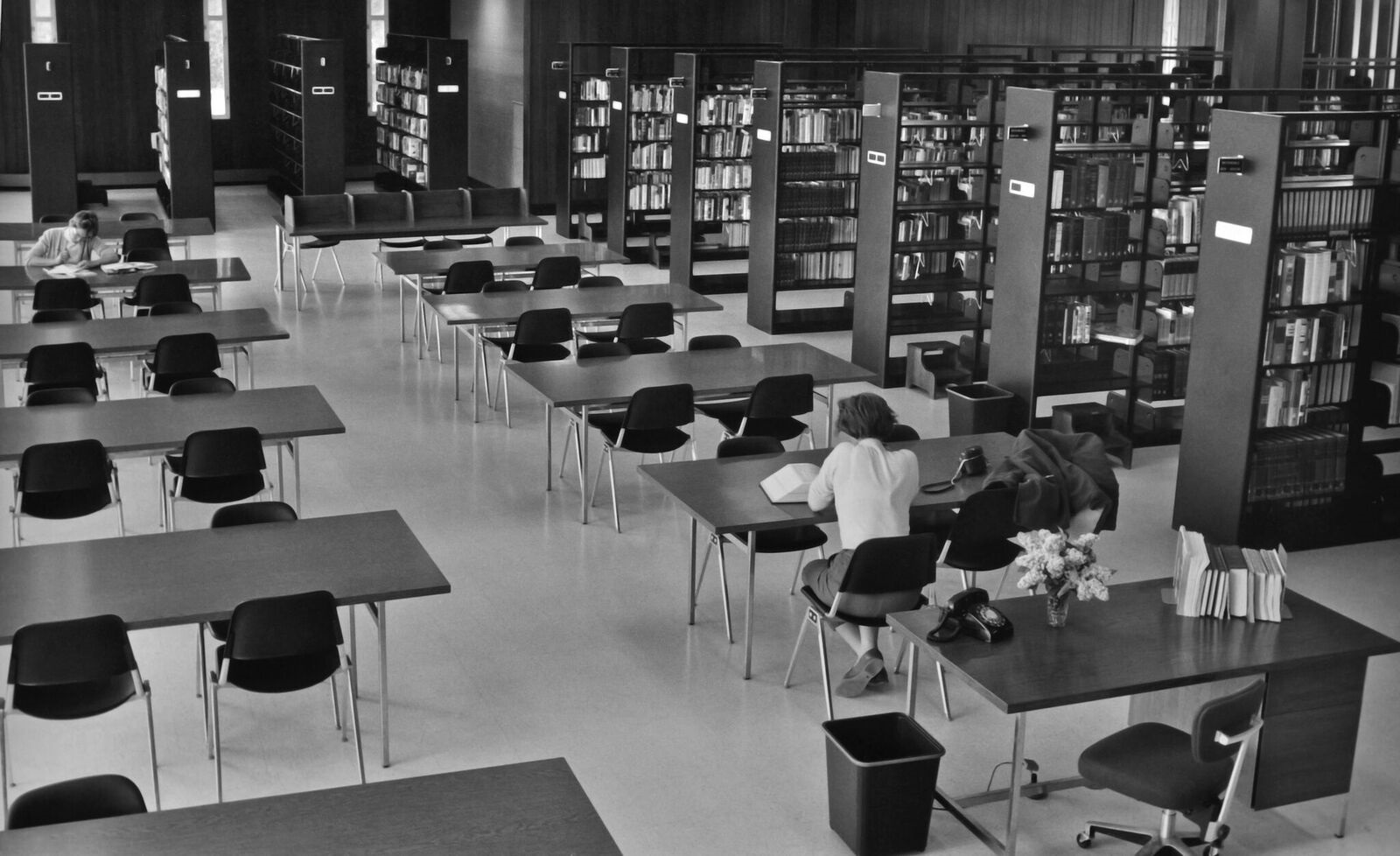
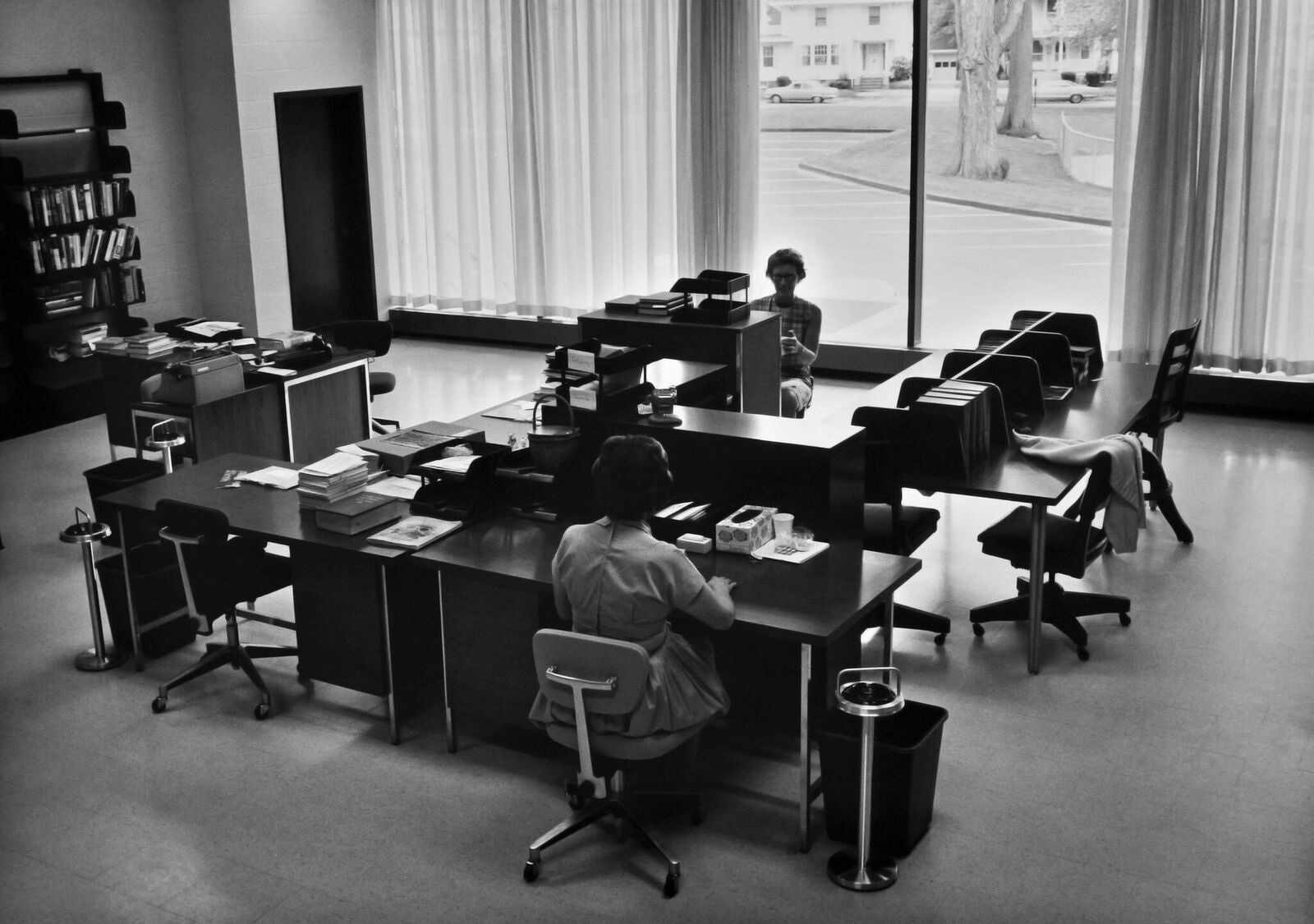
Davis and staff tackled improving the interior with the same low cost approach. They brought things back to the bare bones, got rid of things they don’t need (an especially hard task for librarians), and returned to the original open feel. The Teen Center has taken over shelving originally designed to hold the periodicals that have been replaced by online news sources. These shelves also doubled as an open wall loosely separating the vented smoking section of the original design from the books. “The building works through time,” Davis said. “The stacks were further apart, things have gotten scrunched, but there is nothing about this building that doesn’t work for a library.” The back of the main floor was filled with heavy tables and chairs available for research. The need for that space has dwindled but what remains of it uses the original furniture. The research area even gets converted into a performance space at least once a month. Staff brings in over a hundred (much lighter) chairs to transform the library to a coveted location for a gig. The industrial steel shelves built into the structure intended to house encyclopedias aren’t going anywhere even though their original purpose has. But “it is the glass that makes this building – THIS building,” Davis said, in awe of the 29 panes of 5’x10’ glass mounted on steel beams.
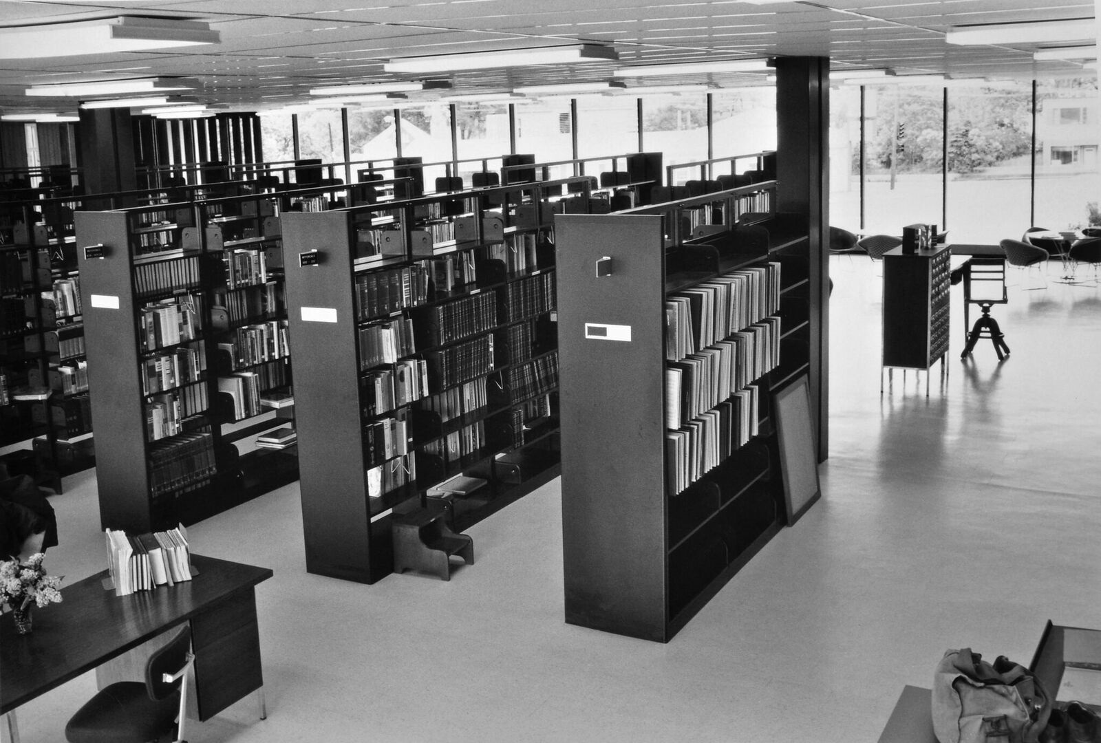
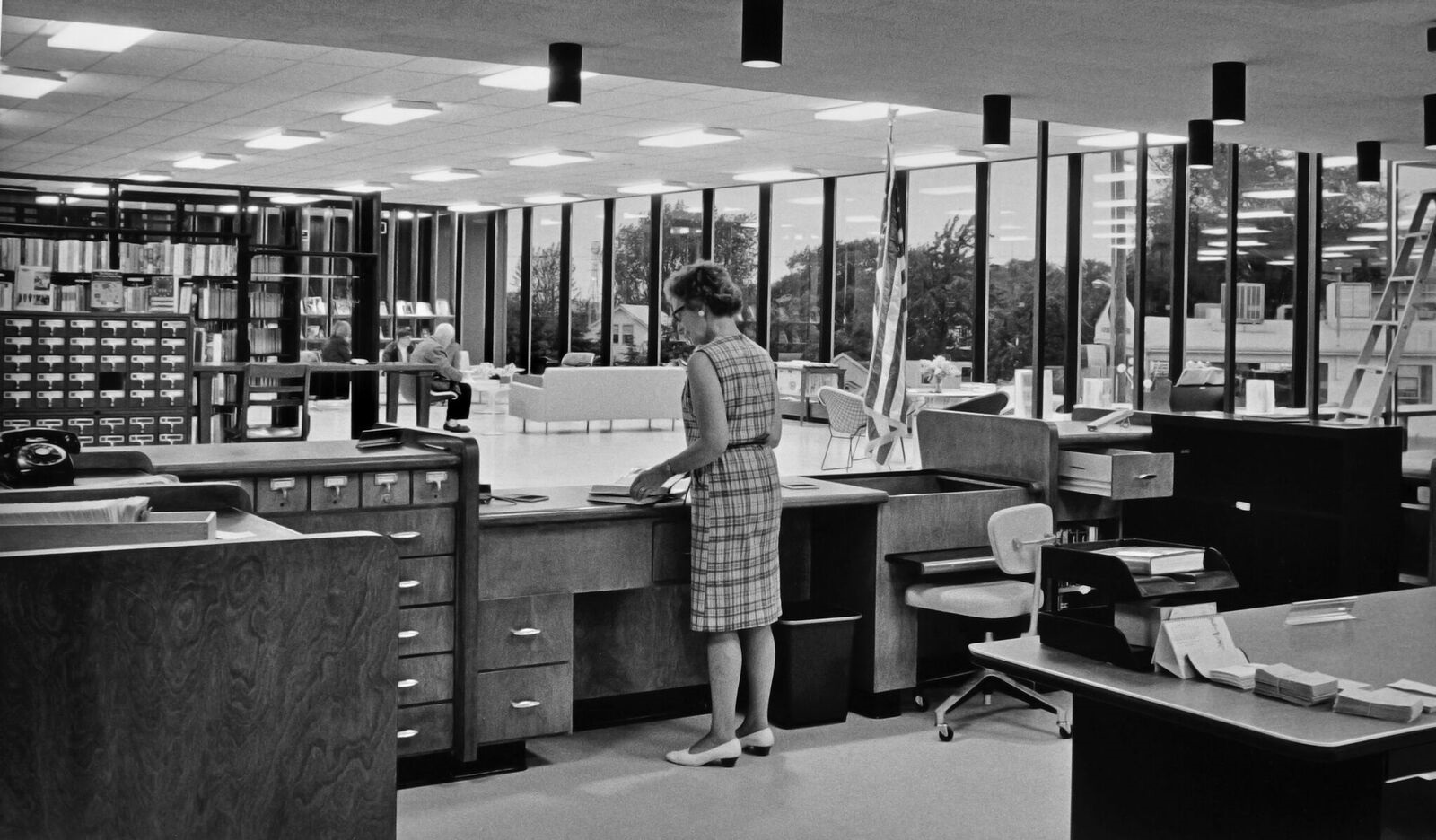
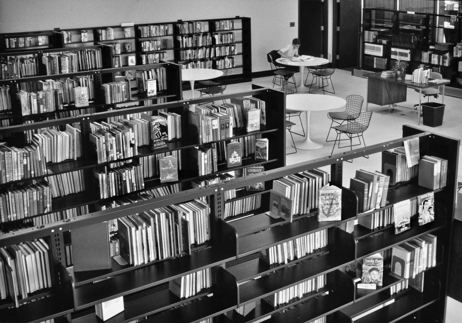
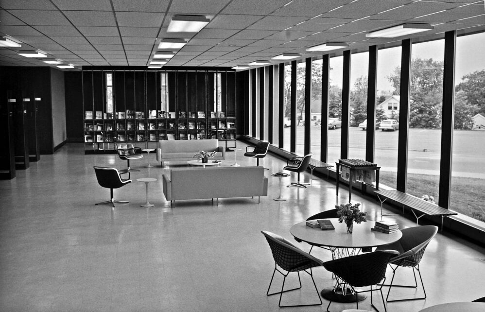
Having gotten the bug for restoration, Davis is using old photographs and stories to try to find the original color of the entrance. He researches fonts to try to find an exact match to the original letters still marking the front of the building. The building is really solid, concrete and steel, but so many of the other features are dated, period or custom. Replacing any lock, faucet, or door becomes a much more difficult task. Every door is a different size and consequently poses different challenges.
The next project on the list is updating the parking lot and making it more pedestrian friendly. Except for the make and model of the cars in the lot, today’s lot looks identical to a picture of it from the 1960’s. A more high visibility project will be refreshing the children’s room. Once Davis started fixing up the outside, John Leasure found his way into the building, introduced himself, and made a plea to finish the design. What was missing? A cascading water feature intended to flow down from the concrete slab sign guarding the front of the building.
1960's Photo By Christopher Grasse
Davis has done almost everything he can without making significant changes to the structure and incurring a high price tag for the city. In order of use, the Community Center, Library, and City Hall, are the 3 areas the public interfaces most with their government. Davis knows investing in the building’s appearance may seem cosmetic but he believes these high profile public buildings represent the city. “These buildings should be the image of who we are to the community. That is worth investing in.”
Kevin Davis, Executive Director
